Ace Relocation - CrewPro Case Study
March 9, 2026Ace Relocation Transforms Operations with CrewPro
Read chevron_rightI’ll admit it. The title might be a bit exaggerated, but I feel there’s no other way to make a point about the importance of involving the user when designing and developing software.
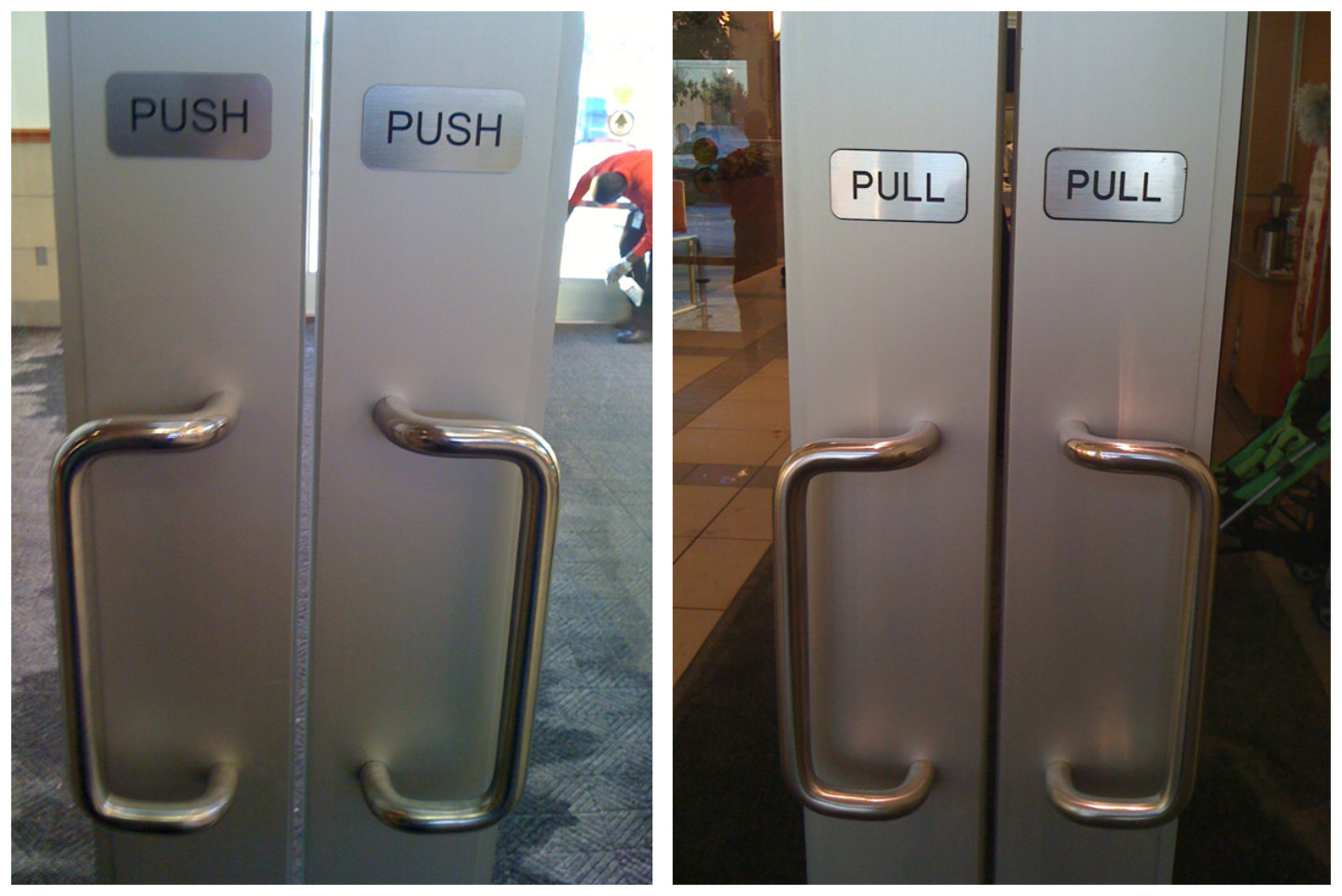
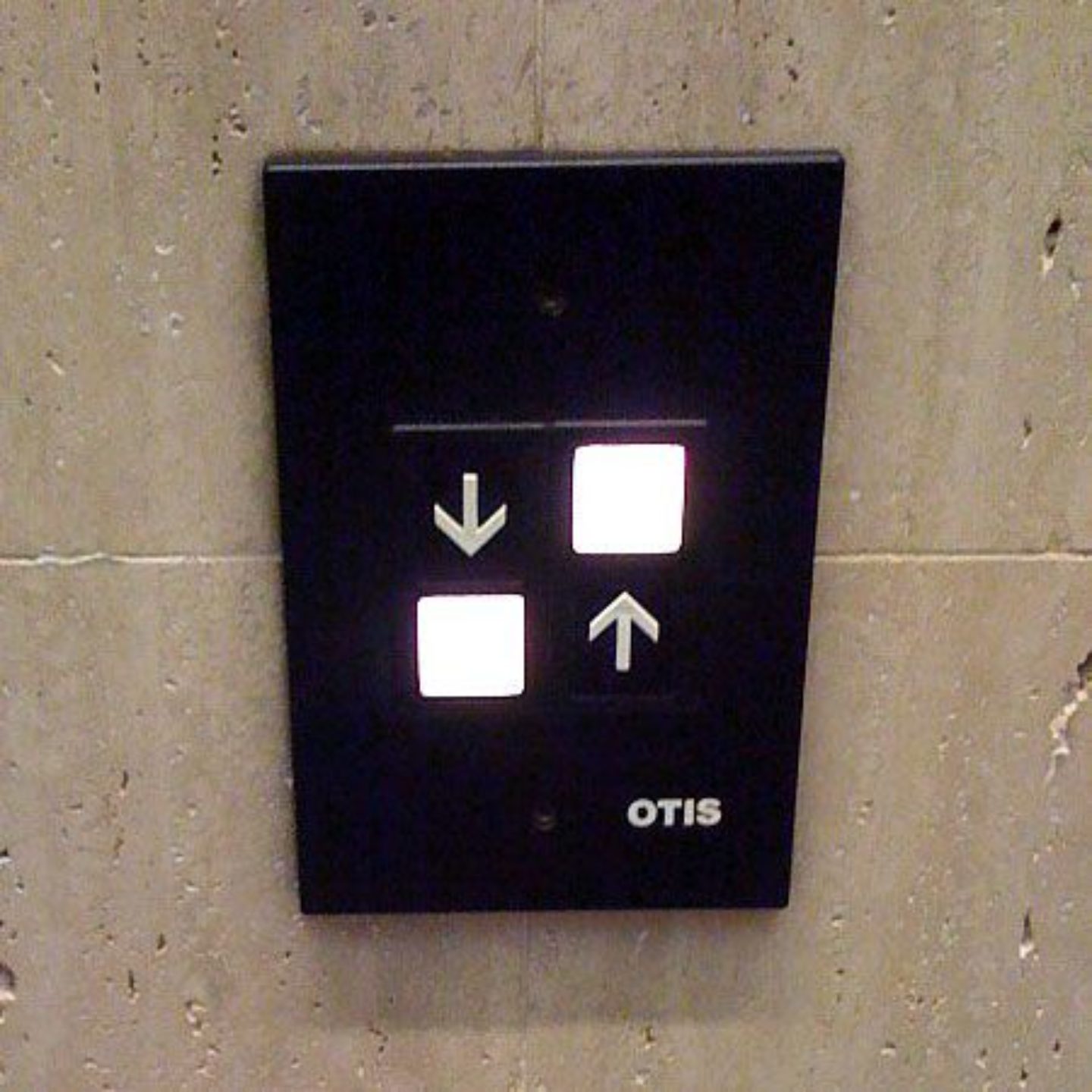
There are so many examples in our daily lives where, despite the best of intentions, design does not match expectations. You might have encountered that door handle that left you shaking the door only to find out you had to push to open - even when the handle itself implied pulling. Or recall that elevator button that left you wondering whether the lift would go up or down?

The famous push and pull doorhandles, recognizable?
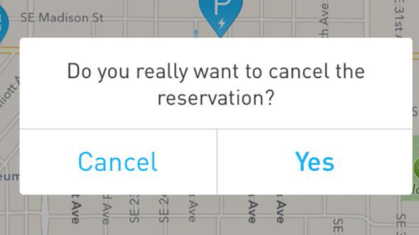
These design flaws may sound like simple, easy-to-overcome everyday annoyances. But when many of these are encountered in a short time-span, especially in software, the user experience can get ruined quicker than you’d like. Buttons that turn out to lead somewhere different than you thought, descriptions that leave you with more questions than they answer or worse: important confirmations or actions (which are crucial processes for your business!) that confuse or scare your user away. Consider the example below and ask yourself whether a user was involved in designing the software. Probably not, right?

I want to cancel, should I press 'Cancel' or 'Yes'?
While a choice offering like the above is actually pretty funny, it becomes less of a laugh when it would be the last stage in your digital purchasing flow - when your client is on the brink of booking his or her move with your company, gets confused by a message such as this and decides to postpone the choice. The user starts thinking, reconsidering a choice he or she had already made! All because one simple question gets ignored too often: ‘for whom am I designing?’ And if this question ís answered beforehand, how come the sole audience you’re designing for isn’t actually involved in the design process? You might want to know how a person feels about the intended product before building it, instead of coming to a painful conclusion afterwards - right?

Do you know which button to push?
More than just preventing flaws, involving users in not only the testing of your product but also during the specification of the product is about finding and discovering user needs that can yield a better user experience and business opportunities you haven’t thought of before. This not only applies to designing a user experience with software, but also to the user experience of a move at your company. What are your customer’s actual needs, what more services would he or she be looking for (but doesn’t ask for because it’s not offered!) and what would make the customer come back next time or recommend your service?
Ever wondered why Netflix automatically starts the next episode after you’ve finished one? To stop you from thinking about what to do next!
What’s more, involving users creates insights into possible ‘gaps’ in your user experience. By observing users’ behavior, you can steer that behavior in the direction that’s right for them - or for your business! Ever wondered why Netflix automatically starts the next episode after you’ve finished one? To stop you from thinking about what to do next! Netflix is already making the choice for you. Because when you start thinking, Netflix just becomes one of the options of what to do next again and has to compete with reading a book, going for a walk with your dog or getting lunch again. Thus, involving users might also extend your website or services’ attention value. By making suggestions of what to choose and what’s right for them - because you show you know them, you can help users make their next choice.
For the last year, at Move4U we have been working on a new product for moving companies that has been designed and built completely from scratch. And while this move management platform has a different angle than the examples above (after all, we’re enabling companies to manage their customers’ moves instead of selling products or keeping people binge-watching films and series), our goal is to stop our users from thinking as well. Because when they have to wonder where to head next, where to find that one customer file or the task they have to complete, that means costly time is wasted. Time that’s better spent providing your moving company’s customers with the best possible experience.
And while you’ll never cover every flaw or possible gap in your user experience, make sure to spend time with your users while developing your products or services. If it results in making them have to think only a little bit less, it will save you and them valuable time and money.
Koen van Lierop has been designing and optimizing the user interaction of the new move management system Reedge for the last year. At the IAM of 2018 in Washington, Koen has presented Reedge to the public and will be closely involved with the overall development of the new platform.